02.05.21
7 Tips on Optimizing Websites for Visually Impaired Users

As technology evolves, more resources and tools emerge that help create a more engaging user experience for website visitors. And when it comes to user experience, accessibility is key. And for people with visual impairments, website accessibility is often an issue. There are over 2 billion people with visual impairments, and making your website accessible to people with disabilities may prove crucial to your site’s performance. Keep reading to learn how you can optimize your websites for visually impaired visitors who come across your online platforms.
1. Give Users the Option to Enlarge the Font
When it comes to your website font, size does matter. Users with low vision may need to zoom into a text in order to read it more clearly, so incorporating magnifying software to enlarge your font size in the browser makes a difference. Older users may be unaware of how to adjust the text from the browser so you can also use an alternate style sheet that won’t break your page layout in order to give flexible font options. Don’t forget to include larger font sizes and noticeable buttons on your page so everything is readily visible.
2. Be Mindful of Your Contrast
Color and contrast directly impact people who have visual impairments like glaucoma, cataracts, and diabetic retinopathy. When designing or updating your website, make sure you have a high contrast between the foreground and background. For example, light text on a white background is hard to read and maybe impossible for a colorblind visitor. You should always be mindful of color contrast in images and graphs used on your site. And the same goes for any colored text featured on background images. Using a contrast checker can help you evaluate how compliant your website is with the current standard and identify any potentially harmful pages.
3. Implement Keyboard Navigation
Modern technology has improved the keyboard navigation experience for visually impaired users, but you still have to do your part. Keyboard shortcuts can make navigation easier by allowing the user to access your website using specific keyboard commands like the tab key. You can add keyboard navigation to your website using HTML links, buttons, and form fields.
4. Don’t Forget Alt Text and Image Descriptions
Images are often overlooked when it comes to web design, but for people with visual impairments, it’s all in the details. People who use screen readers need alt text in order to understand the images on the page. When a screen reader scans over a website, it identifies pictures as “graphics” or “images”. Next, the screen reader finds the alt text and reads it aloud to the user. If there is no alt text, the screen reader will skip over the image, meaning the user would miss potentially informative content on your page. As a best practice, try to keep the alt text within a few lines so the point is clear and succinct.
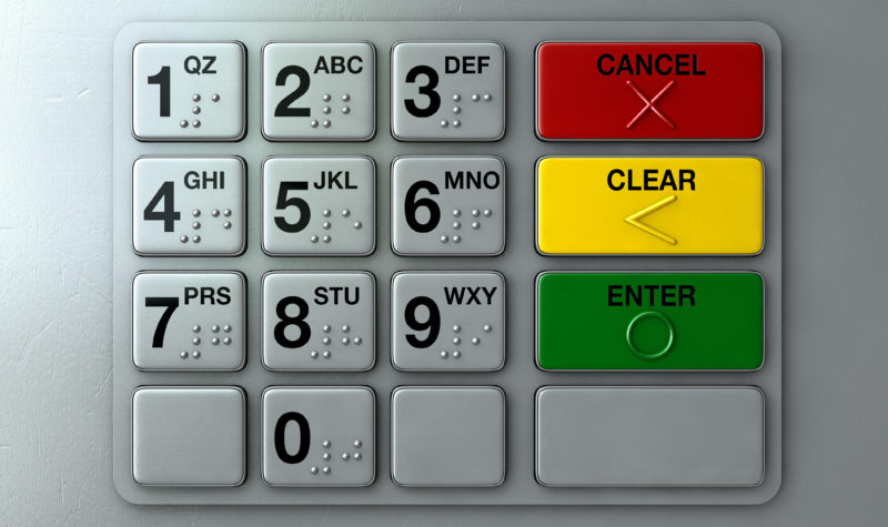
5. Avoid Using Color to Communicate Essential Information
An estimated 300 million people in the world are colorblind. And naturally, they might find it difficult to take action cues based on color alone. You always want to be mindful of how you are presenting your content to a site visitor. We’ve often seen colors like red and green as indicators for actions like “Sign Up” and “Cancel”. Implementing color schemes like this can be great, but you don’t want to direct action on your website by using just color. When creating a button or call to action, try to avoid harsh color combinations and instead focus on using visible text or iconography to reiterate a clear purpose.
Recognizing how colorblind users experience your site might mean adjusting your infographics as well. For example, if you have a histogram on a webpage, instead of just color-coding the bars, you might consider adding textures or simple patterns to them.
6. Use Descriptive Labels For Links and Buttons
To make your site accessible to the visually impaired, the last thing you want to be is vague. When a person uses a screen reader to access keyboard shortcuts, having a link labeled “Click here” is not helpful. Screen readers are a common tool for blind users because they can easily translate web pages into plain text and read it out loud line by line to the user. If the link or button has no text surrounding it except to “Click here”, the user has no context! In contrast, try to make your button labels and links descriptive, simple, and straightforward.
7. Organize Your Page Headings
Headings are an important navigational tool in your webpages. And they should always be organized and clear. We’ve mentioned that screen readers are important for people with visual impairments because they read every portion of a website out loud to the user. Page headings can give a person an overview of the content that follows it and help them navigate your website more efficiently. Without headings, a screen reader will continue skimming through the content on your page without pause.
Everyone deserves equal access to the web, and there’s still so much for us to improve when it comes to optimizing websites for visually impaired users. These are a few tips you can incorporate in order to give users and visitors a better experience on your website. Start with a checklist and implement these tips into your workflow! Try using the online resources to check and make sure your site is accessible, and apply the necessary steps to any future content you create.